
Shopify Development
Why Is My Shopify Store Not Converting? 10 Problems Costing You Sales

Divyesh Kachhadiya
 18, September, 2026
Shopify Development
Divyesh Kachhadiya
18, September, 2026
Let’s discuss how Loomis Guild can design and scale an eCommerce experience built for long-term growth. Start a conversation with Loomis Guild and take the next step toward a refined, scalable eCommerce platform.
"*" indicates required fields
Divyesh Kachhadiya
Divyesh is an Ecommerce Expert with custom store builds, theme development and migration. He is experienced Ecommerce developer sharing his insights for the ecommerce store development.
Quick Summary: Most Shopify stores don't lose sales to one big mistake but to two or three overlooked issues: mismatched traffic, slow mobile load times, unanswered product questions, a weak value proposition, missing trust signals, a poor mobile experience, confusing navigation, hidden shipping costs, checkout friction, or decisions based on guesswork instead of funnel data.
You check your Shopify dashboard and the numbers look active. Visitors are landing on the site, product pages are getting views, and a few people are even adding items to their cart. Yet at the end of the month, sales are lower than they should be. Nothing looks broken, which is what makes it so frustrating.
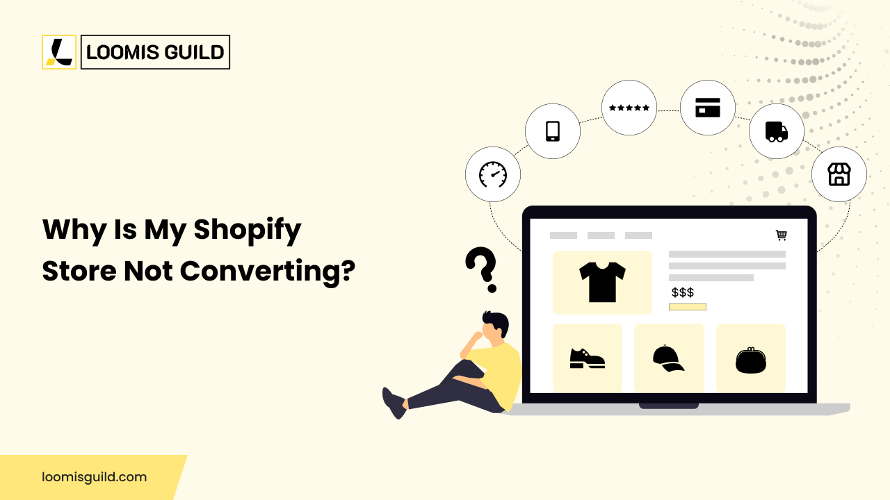
The truth is that “my store is not converting” is not one problem. It could be poor traffic quality, a slow store, weak product pages, an unclear offer, low trust, shipping costs that show up too late, confusing navigation or friction inside checkout. Each of these breaks the buying journey at a different point, and fixing one rarely fixes another. Real shopify conversion rate optimization starts with finding exactly where customers lose confidence or patience, not with guessing at a redesign. This article walks through ten common reasons a Shopify store underperforms and how to find which ones apply to yours.
A low Shopify conversion rate is a result, not a cause. It tells you something is wrong, but not what or where. Before jumping into fixes, separate the possible root causes: a traffic problem, a product problem, an offer problem, a UX problem, a trust problem, a technical problem, or a checkout problem.
The journey usually runs like this: traffic reaches a landing page, moves to a product page, some visitors add to cart, fewer reach checkout, and only some complete the purchase. Each drop-off point suggests a different problem. A high bounce on the landing page often points to a traffic or messaging issue. A high exit from the product page usually means it is not answering buyer questions, and a high exit at checkout usually means friction, not disinterest. This is the core idea behind good Shopify store optimization: fix the stage that is actually broken, not the one that is easiest to change.
More visitors do not automatically mean more sales. If your ads promise one thing and your landing page delivers another, or your keywords attract browsers instead of buyers, on-site polish will not fix the mismatch. Broad targeting and mismatched search intent bring people who were never going to buy from you.
Compare conversion rate by traffic source and landing page. High sessions with almost no add-to-carts usually point to a targeting problem, not a design one. Tighten targeting, match ad messaging to the landing page, and send search traffic to pages that answer the exact query. Conversion work cannot repair traffic that was never relevant.
A slow store quietly pushes visitors away before they see anything. Shoppers rarely complain about speed; they just leave. On Shopify, this often comes from heavy images, too many apps running scripts at once, or a theme that was never properly tuned.
Google evaluates speed through Core Web Vitals, where a “good” score means main content should load within 2.5 seconds and respond to interactions in under 200 milliseconds. Stores that miss these marks tend to see weaker rankings and higher bounce rates.
Test your store on a real phone over mobile data. Removing unused apps, compressing images, and cleaning theme code is technical Shopify store optimization that often produces fast, measurable gains.
A product page has one job: help someone decide with confidence. When it fails, shoppers move to a competitor’s page that answers the question faster. Depending on what you sell, the missing piece could be sizing detail, material information, a clear return policy, or a specification list that removes doubt.
Not every page needs every element. A low-cost item may only need clear photos and a confident description. A considered purchase, like footwear, usually needs more detail before someone commits. Watch product views against add-to-cart rate: low add-to-cart on high-traffic products usually points to missing information, not price. Our guide on building a high-converting Shopify store for fashion brands breaks down what apparel buyers look for before they commit.
Somewhere on your site, a visitor is silently asking, “Why should I buy this from you and not somewhere else?” If your pages never answer that, price becomes the only thing left to compare, a battle most small stores lose.
A clear value proposition connects a feature to an outcome. “Handmade in small batches” is a feature. “Handmade in small batches so no two pieces look the same” is a reason to buy. Ask a few honest outsiders what your store sells and why it is better. If they cannot answer clearly, visitors probably cannot either. Rewriting headlines around outcomes, not just features, is a simple and often overlooked form of Shopify conversion optimization.
Trust requirements are not the same for every store. An inexpensive phone case needs far less convincing than an expensive device from an unfamiliar brand. As price and unfamiliarity rise, shoppers need more proof before handing over card details.
Reviews, clear contact information, a real return policy, and honest brand information all do this job. What does not work is fake urgency, fake scarcity, or manufactured reviews; shoppers notice quickly, and it damages the confidence you were trying to build. Look at your product and cart pages as a first-time visitor would, and put genuine proof near the buy button rather than the footer.
Most Shopify traffic arrives on a phone, so mobile should be treated as the primary shopping experience, not a smaller copy of desktop. A layout that technically works on mobile is not the same as one designed for it.
Baymard’s mobile usability research has repeatedly found that many ecommerce sites still treat mobile navigation, filters, and forms as an afterthought, which shows up in weaker mobile conversion versus desktop. Open your own store on a phone and try to buy something one-handed, on a real network, and notice every place you had to pinch, zoom, or wait. Simplifying menus, enlarging tap targets, and testing checkout on mobile is what a proper mobile ecommerce review is built to uncover.
If a shopper cannot find the right product quickly, they will not keep searching; they will leave. This is common in stores with large catalogues, unclear category names, or filters that do not match how customers think about the products.
Search plays a part too. A visitor who searches for something specific and gets poor results loses confidence fast, even if the product they wanted was on the site all along. Review your top search terms for weak results, and check whether collection pages reflect how customers actually browse. Simplify categories, improve filters, and let breadcrumbs guide people naturally instead of leaving them stuck.
Few things break trust faster than a shopper reaching checkout, seeing the total jump, and closing the tab. Baymard Institute’s cart abandonment research consistently finds that extra costs appearing at checkout is the leading reason shoppers give for abandoning a purchase, ahead of most other checkout problems combined.
This does not mean every abandoned cart is caused by shipping cost, many shoppers were simply browsing. But when someone was genuinely ready to buy and the total changed unexpectedly, that loss was avoidable. Check cart-to-checkout drop-off against how early you reveal shipping cost, delivery time and order minimums. Show shipping estimates on the product or cart page, state delivery timelines clearly, and avoid new conditions appearing only at the final step.
Cart friction and checkout friction are not the same thing. Cart friction stops someone from finalising their basket. Checkout friction stops someone who already decided to buy from completing payment, which makes it the more expensive loss.
Baymard’s checkout usability research has documented over a hundred ways a checkout flow can quietly lose customers, from too many form fields to forced account creation to unclear errors. Complete a purchase on your own store on a device you do not normally use, and count the steps and fields that felt uncertain. Reducing fields and showing payment methods early is where focused shopify conversion optimization pays off fastest, because these visitors were already convinced to buy.
Changing button colours, swapping banners or adding pop-ups without evidence is a common habit, and it rarely fixes anything. Worse, it can quietly hurt a page that was already working.
Shopify’s own conversion rate breakdown report shows how sessions move from landing, to product view, to add-to-cart, to checkout, to purchase. This tells you where visitors drop off, not why, which is where recordings, surveys or direct feedback come in. No single metric proves a single cause: a low Shopify conversion rate on mobile could mean a slow site, a broken checkout, or simply a different kind of visitor than desktop. Combine analytics with what real users say before changing anything.
Work through the funnel step by step instead of changing the whole store at once.
This stops you from redesigning a page that was never the problem. A store that fixes checkout friction when the real issue is traffic quality spends money and sees little change.
The highest-priority issue is not always the easiest one to fix. Weigh each problem against a few questions before making changes.
Business impact: does this affect revenue directly, or just look nicer?
Users affected: a checkout bug hitting every mobile visitor outweighs a copy tweak on one page.
Evidence: prioritise what your funnel numbers show, not what feels obviously wrong.
Ease of implementation: between equally important fixes, start with the faster one.
Risk: checkout changes especially need careful testing before launch.
Merchants often fix the easiest, most visible issue first, like a homepage banner, while a slow checkout or a weak product page quietly costs far more. Good Shopify conversion rate optimization means fixing the friction that costs the most sales first, even when it takes longer to build.
A Shopify store that gets traffic but not enough sales is not a lost cause; it is a diagnosis waiting to happen. The ten problems above rarely show up alone. A store might have a slow product page and a checkout with too many fields at once, and fixing only one will not fully solve the issue.
Real Shopify ecommerce optimization treats these problems as connected, not separate projects. Traffic quality, product confidence, trust, and checkout all feed into the same number at month-end. If you are still unsure where your store is breaking down, it may help to bring in a second, experienced set of eyes. You can talk to the Loomis Guild ecommerce team about a practical, data-first look at where your store is losing sales.



let’s build something great
Tell us about your project and our ecommerce specialists will get back to you with clear next steps.
Complete the form and we’ll be in touch shortly.